You know what I mean, right?
In some applications, there’s a Preferences item under the File menu. In some applications, there is an Options item under the Tools menu. In some applications, there is a Personalization item under the Edit menu. What’s a user suppose to do? Well, hunt for it – that’s the way it used to be. Do you see the problem? Of course you do. You’re smart.
What’s the user supposed to do?
Windows 8 apps access settings (and about screens) one way – for the operating system and for applications alike. No more hunting, just consistency and happiness. Swipe from the right to reveal the Charms (Win+C) and hit the Settings charm (Win+I) to reveal a list of options for Windows 8 and the current Windows 8 app.
The Info Pane
I can’t be 100% sure that it is officially called the info pane. But the fact that Win+I opens it, I hope it’s called the info pane – for consistency sake.
But, after the user taps the Settings charm, the info pane appears. There is a list of commands (in the image to the right there’s Internet Options) and these are programmatically added by the developer.
Note: permissions cannot be removed. It is present for every Windows 8 app and allows the user to adjust the permissions of the apps’ device capabilities. Guidelines recommend that your options area should not duplicate this functionality – let permissions be permissions.
In short, “Internet Options” and the other commands are just a kind of link button. The developer provides the text and the method that will be executed when the user clicks it.
After the click
And what happens when the user clicks that link? Well, the developer decides. One scenario is that the user is taken to a web site. That’s right. In some cases, the correct action is to take the user away from the app and to the internet. In this case, text like “Options” should read “Options (online)” so the user is not confused by the result of their action. Otherwise, developers show their settings dialog.
Using the XAML popup
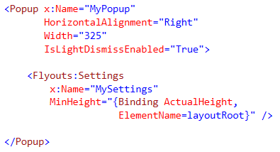
In order to show the Setting “flyout” we don’t use a flyout control. That’s because there is no flyout control. There’s, instead, a Popup control. This control makes it pretty easy to show a setting dialog.
In the code above I create a <Popup> control and nest inside it an instance of my user control <Settings />. Then in the code behind (below) you show your Settings dialog by revealing the Popup that you have defined in your XAML.
The code above registers (and unregisters) the CommandsRequested event. This is the event that is raised by the operating system when the user taps the Settings charm. And it is in this events handler that we tell the operating system what links to include in the info pane.
There more you should do!
The Popup is a handy control but it leaves a lot for the developer to implement. Like:
- Handle Snap View
- Handle Orientation Change
- Implement the Back Button
- Add Animation
- Obey Guidelines, things like Width
And how are you going to do those? You are going to write the same code that many other developers have already written. And from conception we developers are bread to hate redundancy, right? The good news is, there are libraries out there to help you save code.
Callisto
Callisto is a nifty library that offers a new control called SettingsFlyout that inherits from the Popup and implements the code you would otherwise have to write and rewrite. In the case of Callisto, ther eis no need for the Popup defined in your XAML. It is all dynamic. You also need to implement far less in your settings dialog. You would implement it something like this:
In the code above, see the difference? The command callback is where the SettingsFlyout control is created. It’s also where the heading text is set, rather than in your XAML. It’s all nice, compact, and easy to add to your Windows 8 projects through NuGet.
My Settings Helper
Like Callisto, my helper reduces your code and XAML. But unlike Calisto, my helper is a drop in class. As a result you can steal from it as you like. As a result you can change it as you like. But you don’t get it from NuGet. If you prefer such an approach, you can have it for free (here) and implement it like this:

Simple Layout
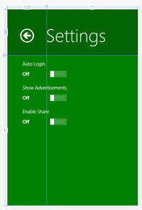
A Settings dialog looks pretty standard. A bunch of buttons, dropdowns, textboxes, checkboxes, radiobuttons, and toggleswitches. (sort of like what is at the right)
The XAML to create such a simple layout is super straight forward. But let’s look at what it might look like together:
In the XAML above, we generate our UI. We use a grid for layout and setup three toggle buttons. Wiring up these toggle buttons can be as easy code as this:
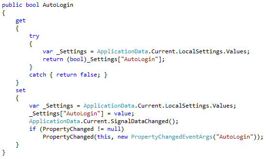
In the code above, I define a property whose backing is the LocalSettings dictionary provided by the WinRT API. This dictionary is self-persisting and is not cleared when the user closes the app. It’s the perfect property bag for your app settings.
Guidelines
Just when you thought you had it all figured out, there are UX guidelines to help you make that Settings dialog even better! It’s true! Remember guidelines are to be followed unless they aren’t And, what I mean is that you can break these guidelines if your app requires it. But if your app does not require it then you should not break them. Let’s take a look (source):
Note: there are many guidelines, these are my favorites!
- Use the Settings as the single entry to app's settings
- You can link programmatically to the Settings charm
- You can link programmatically to your Flyout
- Link to app settings to log in
- Link to app settings to update credit card info
- Define defaults and decrease the number of settings
- Provide settings that are applied instantly
- Use the Settings charm to provide access to app info
- Don't include typical app workflow, like brush color
- Avoid adding more than four entry points
- If some settings are not relevant in a context, handle them in the Flyout, not by changing the entry points
- Entry points should open a settings Flyout. If going directly to the web, add "(online)" after labels that go
to the web, for example, "Help (online)". - Don't duplicate “Permissions” information
- If you have only one entry point call it "Options"
- Use one-word labels whenever possible
- Limit scrolling to two times the screen height
- Flyouts must be full screen height, regardless of orientation, and (346 pixels) or wide (646 pixels)
- The header's background should be the same as the app's color, the background color of the Start tile
- The border is be the same color, but 20% darker
- Display settings contents on a white background
Conclusion
You can do it! You can make an awesome Windows 8 with a great settings experience. With these techniques and the guidelines to get you started, you can knock it out of the part and build a great app.
Best of luck!


