Windows 8.1 is coming. The release date is close. It’s free. Why upgrade? Not only are upgrades sensible from a performance and security perspective, but you get new features. One recipient of some feature love is the Start Menu. If you have already installed the Windows 8.1 preview, then you have experienced some of this magic. Like what? Let’s take a look!
1.  Start button
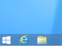
To me, I don’t need a Start Button. But let’s face it, the Start Button is important to most users. It’s comfort food to Windows users – and in the end, nobody matters like our users. In Windows 8.1, it’s back from its vacation. What does it launch? The Start Menu, of course.
Bonus: Right-click the returned Start Button (or Start “Tip“) and reveal the Quick Link menu for experts. This menu, which was previously only available through the Windows+X keyboard shortcut, reveals handy advanced features for expert users. Want more? The Quick Launch menu now includes Shut Down and Sleep commands. Want to shut down with the fewest keystrokes, use this menu!
2. New size tiles
I think Windows Phone hit it out of the park when they introduced the small tiles. With Windows 8.1, I get the same small tiles, plus a large tile option that is the equivalent of two wide tiles, stacked. Putting more on my Start Menu means easier access to more applications, even the ones without live data and even the ones I only access occasionally.
Bonus: In addition to resizing tiles in the new Start Menu, manipulating tiles has also been given a facelift. More like Windows Phone, the Start Menu goes into an “edit” mode when the user touches and holds a tile. From there tiles can be rearranged, resized, and grouped with useful names. No more mistakenly dragging a tile while panning. Plus, Windows 8.1 lets you multi-select and multi-uninstall. It’s a dream, esp. for dev-types.
3. Roaming layout
Maybe it’s just me, but I spend a lot of time tweaking my Start Menu layout. My OCD and I like it just right. And then, I change my mind on what “just right” even means. That’s real work, and I hate repeating it when I log onto another device. With Windows 8.1, my Start Menu layout roams across devices, following my account wherever I log in – and saving me from repeating my endless task.
Bonus: Windows 8.0 introduced the touch-friendly control panel but missed some settings. As a result, users would toggle to the desktop control panel from time to time. With Windows 8.1, the touch-friendly control panel gives you everything in parity to the desktop control panel. All there, and all finger-friendly.
4. Reordering programs
The Start Menu is a list of for favorite or most frequent apps. It’s your personal dashboard. And, when you need an ancillary app, you search for it or view all apps to find it. Viewing all apps is painful when the sort is simplistic and static. With Windows 8.1, you can sort your apps by frequency, folder, name, and more. Plus, accessing all is just a single swipe up. Simple? Maybe. Brilliant? Certainly.
Bonus: On that note (that your Start Screen is your dashboard), with Windows 8.1 users will find even more value in their Lock Screen, even before they log in. The Windows 8.1 Lock Screen delivers a photos slide show from your local or cloud photos and direct access to the camera, just like Windows Phone. It’s all there, and it’s all good.
5. Desktop background
Some Windows 8.0 users found the transition from the desktop to the Start Menu to be abrupt and startling. With Windows 8.1, users can set the background of their Start Menu to match the desktop background. As a result, the transition to the Start Menu is a graceful experience. It really is. And, for those who loved the animated designs as their Start Menu background, those are still there.
Bonus: Many Windows 8 users don’t have a touch device. With Windows 8.1, users now have the ability to customize what the corners do. And, users can boot directly to their desktop. The Start menu can display on the active display when you have multiple monitors, and, should you want to default to App Apps view, you can.
Summary
Some subtle improvements in Windows 8.1 show dramatic concern for user feedback. Then again, sometimes Windows 8 sticks up for itself and the direction it is leading. But in 8 short months, this small update to Windows 8.0 feels anything but small. And in the best tradition of Windows, it puts more and more power in the hands of the user. Configure to your heart’s content.
Best of luck!

