 WHAT DESIGNERS HAD BETTER KNOW ABOUT WINDOWS 8.1
Let’s be perfectly clear, the Windows Design Guidelines in Windows 8.1 are, at a high-level, identical to those in Windows 8.0. However, in their practical and tactical guidance they are so different, that idyllic Windows 8.1 apps would potentially fail Windows 8.0 Store Certification. These guidelines, now hardwired into Microsoft developers and designers, remain consistent and contrarian to the Windows 8.0 guidance.
Microsoft Design Principles
The 5 core principles of the Windows Style, or the Microsoft Design Principles are unchanged. They are: 1) Pride in Craftsmanship, 2) Fast and Fluid, 3) Authentically Digital, 4) Do more with Less, and 5) Win as one. They have not changed in practice or in theory.
In addition, many tactical guidelines also remain the same. For example, the navigation model of Hub-Section-Detail remains a best practice. Leveraging the edge and grouping commands remains a best practice. In addition, Layout flexibility and touch-friendliness remain best practices.
 Why has guidance changed?
However, some developers and designers may be surprised to learn what has changed. Why has guidance changed? Basically, because 1) telemetry has revealed new usability data, 2) feedback has confirmed user expectations, and 3) partners have uncovered development hurdles.
This isn’t marketing, this is real life. New Windows users had serious trouble with some Windows 8.0 features. Even tenured Windows users had deep adoption anxiety because of feature expectations. And, developers and designers uncovered significant opportunities to improve the platform.
Here’s a better answer.
Microsoft design guidance has changed because we measure usability, listen to users, and care about our developer community.
We could have said, “We know what you really want, now shut the front door.” Some have done that. But that’s not what happened. We pivoted in order to evolve the new Windows experience from good to great. And, we’re not done.
Okay, so what has changed?
Here are the big four changes.
Search
![]() Windows 8.0 aggressively reduced chrome, almost to an obsession. I’ve taught the guidelines myself: don’t put borders around things, don’t put buttons on your canvas. And, as a result, apps embracing the guidelines are impressively clean and minimal.
Windows 8.0 aggressively reduced chrome, almost to an obsession. I’ve taught the guidelines myself: don’t put borders around things, don’t put buttons on your canvas. And, as a result, apps embracing the guidelines are impressively clean and minimal.
What’s new: In Windows 8.1, we still coach developers and designers to create clean and minimal interfaces to increase beauty and usability. But, we also coach that some buttons belong on the app canvas. This is especially apparent with the new SearchBox. Where Windows 8.0 had a search experience driven by the Search Charm, Windows 8.1 has a search experience driven by the in-app SearchBox control. Learn more about the SearchBox here.
What hasn’t changed: Search in Windows 8.0 introduced Search History, Query Suggestions, and Result Suggestions. These powerful concepts have not changed, they have simply moved into the app. Users typing their query and THEN selecting what app to search – that’s a workflow of the past. As a result, the Suggestion limit has been raised from 5 to 25. Moreover, you can add your app’s data to Window’s Index that feeds the Search Hero.
My take: As an aside, I believe this guidance has changed because invoking the charms bar hasn’t proven to be as intuitive as the original operating system designers has hoped. Where one-search-to-rule-them-all was an innovative idea, users were left asking “How do I search?” And, though a unified search experience might have played out to be best, we can’t leave users wondering.
Windows silhouette
![]() Windows 8.0 gave very prescriptive guidance to developers and designers insofar as the skeleton and basic shape of their app. We called it the Windows Silhouette – and it caused me endless spell-check consternation to type that word correctly. The Silhouette was an overlay, similar in concept to the golden ratio, that developers and designers could use to ensure that their app not only had visual consistency with the Windows ecosystem, but visual alignment with the operating system. It helped ensure that Windows apps felt like Windows apps. Learn more about the silhouette here.
Windows 8.0 gave very prescriptive guidance to developers and designers insofar as the skeleton and basic shape of their app. We called it the Windows Silhouette – and it caused me endless spell-check consternation to type that word correctly. The Silhouette was an overlay, similar in concept to the golden ratio, that developers and designers could use to ensure that their app not only had visual consistency with the Windows ecosystem, but visual alignment with the operating system. It helped ensure that Windows apps felt like Windows apps. Learn more about the silhouette here.
What’s new: In Windows 8,1, we still coach developers and designers to create visually consistent apps that embrace the Microsoft Design principles. However, we have deleted the silhouette completely. Application developers and designers can use the silhouette, but it is no longer a leading recommendation or requirement during design reviews or certification.
My take: The Windows silhouette was an important tool for an important time. Developers and designers had never made a Windows app. They didn’t understand the style or its principles. Today we have driven the design message into our community and there are more than a hundred thousand apps developers and designers can reference – including our first party apps. The silhouette created consistency, but eventually contributed to repetitive and unimaginative app designs. Personally, I will continue to teach the silhouette as a starting place for new apps – but not neglect the important message that an app has the freedom to what is best for that app.
Microsoft apps don’t always follow the silhouette: Below, are screen caps of some of the preview first-party apps in Windows 8.1. In them, you can see that the Windows silhouette does and doesn’t show up in app design. The nod to the silhouette is intentional. Your app might do the same. The requirement is gone, however.
Design grid units
![]() Designing a Windows 8.0 app means understanding the 20x20 grid structure. That is, a single unit was 20x20 (basically 20 pixels by 20 pixels). For the sake for a comprehensive language the sub-unit was defined as a 5x5 unit – decisively not a 1x1 unit. As you layout pixel-perfect app designs, these subtleties start to mean more. As a result, an app leveraging the Windows 8 Grid System had a natural consistency in spacing and overall presentation. Learn more about the grid here.
Designing a Windows 8.0 app means understanding the 20x20 grid structure. That is, a single unit was 20x20 (basically 20 pixels by 20 pixels). For the sake for a comprehensive language the sub-unit was defined as a 5x5 unit – decisively not a 1x1 unit. As you layout pixel-perfect app designs, these subtleties start to mean more. As a result, an app leveraging the Windows 8 Grid System had a natural consistency in spacing and overall presentation. Learn more about the grid here.
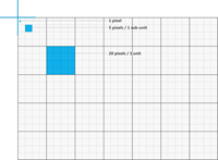 What’s new: In Windows 8.1 the design grid primary unit has is the 5x5 unit, which was previous considered a sub-unit. Any app can still leverage a 20x20 unit, but Windows 8.1 apps will demonstrate a tighter UI that will “snap” to a compressed 5x5 unit. The large padding, margins, and spacing in Windows 8.0 apps will make Windows 8.1 apps noticeably “different”. Only developers and designers who understand this subtle design shift will understand why they seem different. To a typical user, Windows 8.0 apps will just seem a little “dated”.
My take: One of the biggest considerations in app design is touch target accuracy and friendliness. Increased spacing and margins allow users to easily see delineations in data and successfully tap interaction controls. Having said that, my 2nd grade daughter writes on notepaper with wide, two-inch lines. This is easy for her. My 6th grade daughter writes on notepaper with tight, half-inch lines. This is easy for her. Similarly, a tight UI assumes more from our user base. It assumes familiarity and proficiency with touch. An assumption which, I feel, is based on reality. This change is comment about that and a compliment to the everyday Windows user. Bravo.
Snap View
![]() In Windows 8.0, you would not get your app certified without support for the Snap View, a narrow 320 pixel wide view of your app which users may or may not use (often dependent on monitor resolution). This enabled a core differentiator for Windows tablets over Android or the IPad – the ability to show and interact with more than one app at a time. With your app in Snap View, the user could simultaneous leverage another app in the rest-of-the-screen, “Fill View”.
In Windows 8.0, you would not get your app certified without support for the Snap View, a narrow 320 pixel wide view of your app which users may or may not use (often dependent on monitor resolution). This enabled a core differentiator for Windows tablets over Android or the IPad – the ability to show and interact with more than one app at a time. With your app in Snap View, the user could simultaneous leverage another app in the rest-of-the-screen, “Fill View”.
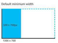 What’s new: In Windows 8.1 the term “Snap View” is completely gone, though the concept of a 320 pixel wide view of your app is still supported. However, this 320 pixel wide view is no longer a required minimum to get into the Windows Store. In Windows 8.1 the new minimum width that must be supported is 500 pixels. In addition to this new 500 pixel width, Windows 8.1 apps can be subject to a wide variety of widths that are completely selectable by the user.
My take: It didn’t take a genius to figure out that Windows 8.0 had to support more widths than Snap View and Fill View in order to satisfy technology pundits and power users who take the “windowing” features of Windows to the extreme. Windows 8.1 supports variable sizes including 50:50, which was a big request. In addition the same app can be launched more than once – which was another big request. This new feature was inevitable and is a welcome benefit. To the app developer, however, they need to think about horizontal screen breakpoints like web developers already do. Learn more about the new sizes here.
Conclusion
 Once thing is clear, Windows 8.0 released with a lot of functionality prepped but not shipped. In a mere 8 months, Windows 8.1 releases with 5,000 new APIs and tons of new features and functions. But design changes, those are a different story. Design changes are, in some part, the result of Windows 8.0. What you see promoted and supported in Windows 8.1 is a suite of reactions to the Windows community and an amazing push to make the platform better, more approachable, and more useful.
Best of luck!
