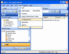
A recent discussion reminded me of an old UI/usability principle that users prefer a layout they already know.
The idea is that users don’t want to learn your product. They want your product to be like products they have already learned.
For this reason, developers often feel the urge to copy the Office look and feel. And, why not? MS spent $Ms on usability testing.

Applications that look like Outlook are a dime-a-dozen, but that doesn’t mean they’re bad. It means users understand them.
There’s more you can copy for success. Windows has familiar layout. Consider the windows explorer, users already know it.
Remember, when you are designing your application, don’t try to be too original. Crazy layouts and stupid colors are your vanity and not a favor to the user. Be creative, yes, but be familiar, too.