My scenario is simple. I wanted to do a search for Contacts, and have the results be a bunch of rolodex cards loaded in a WrapPanel. Here’s how I did it.
Please note that each screen shot builds on the previous screen shot. You can’t just jump to one of them and get something (unless you jump to the end).
Sample Data
I needed some classes. I don’t like declarative data. I like classes. So I created Contact and Contacts. There’s nothing special about them. Here’s the code:
See that ObservableCollection I am using for People? That’s just like List<Person> except ObservableCollection has events indicating membership has changed.
Databinding the ItemsControl
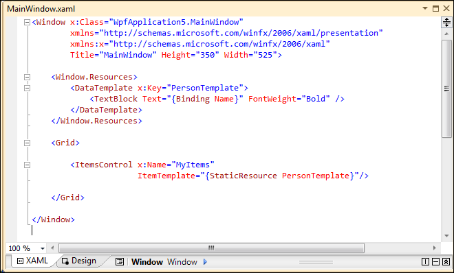
Next, data bind People to to the ItemsControl. The ItemsControl reminds me a lot of the Asp.Net Repeater control. Other controls handle layout. And here’s how to do it:
See the PersonTemplate I created? I could have made it a resource of the Grid, or a property of ItemsControl. Eventually, I will move it to a separate file. Here’s the code behind:
Yep. That’s it – and we won’t be changing this code behind for the rest of the scenario. And here’s what it looks like when you run it:
Adding a WrapPanel
This is a start, right? But where are my cards? My WrapPanel? And where is a little formatting to make this look like a professional app and not a sample? First the WrapPanel:
See how the WrapPanel ends up as a child of the ItemsControl? I point that out because it is not 100% intuitive to do things like that. But that’s the technique. Here’s the UI:
Adding Grouping
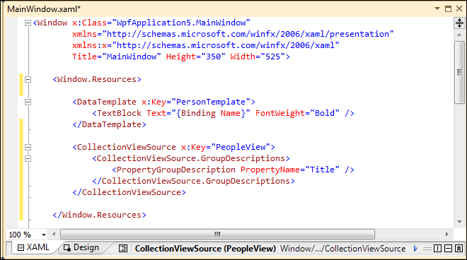
Now, in a sense, we are done. But let’s add grouping? We’ll need a CollectionViewSource to do that. It defines which property is the “group by” property. Here’s now:
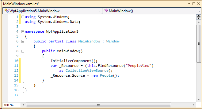
See the CollectionViewSource with a PropertyGroupDescription of Title? Now, it doesn’t have a reference to the People class. Not yet. I will do that from Code Behind like this:
See the FindReference bit? That’s where I go get the CollectionViewSource (there’s no other way, really) so I can set its Source property to People.
Now, to show groups we specify a HeaderTemplate under GroupStyle. There will be an item for every group header with a WrapPanel as its next sibling with a filtered list of items. Here:
See that I have added a new HeaderTeamplate in the Windows Resources? Like PersonTemplate, we’ll be moving that off to it’s own file.
Here’s a really helpful note: no matter what field you are filtering on, in the HeaderTemplate you bind to Name. You see, the header is binding to the group, not the item anymore.
The real magic around grouping is handled in ItemsControl.GroupStyle. It allows you to indicate the HeaderTemplate if the CollectionViewSource indicates a Group.
Here’s the resulting UI:
Adding Sorting
But what if you wanted to add some sorting? I want to sort the Groups Descending (Z-A) and I want to sort the People Ascending (A-Z). Is this difficult? Not with CollectionViewSource.
There’s something very important to notice, and I highlighted it in the screenshot. See that I have added a namespace reference to System.ComponentModel – that is important because SortDescription is located there (for some reason). Here’s the result:
Moving Resources to Files
Now, let’s clean out those Windows.Resources. This will make your XAML smaller (more manageable) and let you reuse resources on separate Pages or Windows.
First you will need to add a ResourceDictionary to your project (it’s just a file); pick it from the Add New Item dialog. Here’s a screen shot:
All I did was Copy-n-Paste from Windows.Resources into my PersonTemplate and HeaderTemplate files. Then I replace them with this in Windows.Resources:
In so many ways this is like a CSS link. Now my DataTemplates are stored in separate files that can be checked out by separate developers. By the way, I only left the CollectionViewSource to show you how to combine linked and local resources.
Styling the Output
Let’s take some time to make our data look a little nicer. We’ll start with the header. Let’s make it look nice – but remember, not too sexy. Let’s not unleash every WPF feature on our user.
If we update the HeaderTemplate with some extra style like this:
We get this:
If we update the PersonTemplate with some style like this:
What’s that? You can’t read all the code? Don’t sweat it. 1) you need to learn to develop a little on your own and 2) I will include all the code it at the end.
See the CornerRadius attribute on the Border? That’s what allows me to have rounded corners. The bigger the number, the greater the rounding.
See the Style.Triggers where I handle the classic MouseOver effect? You can do anything, of course, but I color them orange. It’s the IsMouseOver property that you want to test.
You get this:
Making the Header Collapse
Let’s say you want the Header to expand and collapse. We’ll need to make a few changes. Specifically, we must use a ControlTemplate instead of a DataTemplate for the Header.
Unfortunately, this is not possible using ItemsControl. We need to switch to ListView. They are from the same base class. Then we update ItemsControl.GroupStyle like this:
See the ContainerStyle? That’s where I am injecting the template name. But our current HeaderTemplate is a DataTemplate and that is not right. We’ll need to change it like this:
When the UI does what we want:
And when you look at the code, there really isn’t a lot. Not even a lot of XAML. But there sure is a lot of opportunity to mess it up or get the syntax wrong. But once you have it, it’s beautiful.
Warning
If you are like me, and I hope you are not, then you might occasionally get this error:
“Operation is not valid while ItemsSource is in use”
Although it seems that the error message is a little to “generic” it typically means that there is a syntax error in the way you have the XAML configured. If you get that, then double-check your XAML. Odds are, you have something typed wrong or in the wrong location or something.
Good hunting.
Here’s the code: You’re Welcome
(64k zip of the whole solution)


